PPC can provide your business with instant results and high levels of control. To get the most out of your PPC traffic, your ad and landing page will need to work together perfectly to boost conversions.
Have you ever searched on Google, clicked on an ad and clicked straight back to search? This is an example of how a landing page can be the difference between a site visitor and a customer.
Learning the ins and outs of PPC will make you a more effective marketer and ensure you’re getting the most from your clicks. So, we’re going to go through our best practices to encourage your PPC traffic to convert.
Be consistent
You may have clicked on a promising, engaging ad just to find it’s followed by an irrelevant or low-quality landing page. A great PPC ad will drive plenty of clicks – but you’ll struggle to turn these into sales or conversions without a highly relevant landing page to follow.
Keep things like messaging, tone and brand voice consistent throughout your campaign to avoid deterring customers.
Keep things simple
A user is clicking on an ad because they want to complete an action. If they can’t find a quick route to this action, they probably won’t stick around.
Think of this page as your ‘shopfront’; it’s often the first impression that visitors will have of your brand – meaning its quality can determine whether somebody will continue to browse or bounce back to the search results page. Make it clear, to the point and easy to navigate. Here’s how:
- Links – Clear links can help to avoid any confusion from customers wanting to navigate to a page. You could also consider a search tool on your landing page if needed.
- Buttons – To avoid losing potential customers, use eye-catching buttons. For example, if your ad promotes a particular product, make sure your CTA (e.g., ‘buy now’ button) is in clear sight when users click onto your page.
- Consider a chat tool – A chatbox is a great way of quickly and directly responding to customer questions, feedback and queries.
- Keep on brand – Use your brand colours and voice, you’ll become more recognisable if you keep a consistent theme on your landing pages.
Use clear and concise headlines
Ideally, users should be able to scan through your headlines with ease and pick out the topics that matter the most to them. When creating content for your landing page, keep your headlines concise with supportive copy to follow.
Optimise your forms
Forms are often a key part of a landing page – especially if you’re aiming for things like email sign-ups and subscriptions. Once a visitor provides their contact details, you’ll have a qualified lead for future campaigns. We’ve listed our best practices to get yours right:
- Use blank spaces when needed – Customers might leave a site if there is too much information in one area. Use blank spaces to avoid your form being overcrowded.
- Think carefully about your CTA – Users need to understand why they’re filling out a form, so make sure you focus on how they will benefit. For example, “Get your discount code today” or “Sign up for new product alerts”.
- Design for mobile – You could either use responsive web design or create a mobile-specific landing page to avoid overwhelming mobile users.
- A/B test your forms – Experiment with placement, copy, colour and more to determine what your site visitors respond to the most.
Keep testing
Following all these tips will certainly make improvements when it comes to driving more conversions. However, if you want to have a real understanding of your target audience and what works best for them – then you’ll need to perform user tests. You can test everything from your ad copy and landing page copy, to your CTA and your forms.
Optimise for mobile
Your entire landing page should be compatible with any device. It’s arguably not enough to be just mobile-friendly anymore; we would recommend prioritising mobile users in most cases. So, what are some of the best practices to make you’re not deterring your mobile visitors:
- Keep it short and simple – Mobile users are usually on-the-go, so keep it concise and try not to overload them with information.
- Use a clear font – Avoid a font that is too small so that users won’t have to spend time zooming in.
- Make your CTA stand out – Mobile users are generally goal-orientated, so having a clear CTA can help them to reach that objective quicker.
- Use click-to-call: Have a click-to-call button so that visitors can quickly contact you if they need to.
We have a page on optimising a mobile landing page for conversions here.
Build trust
Your landing page is your chance to show potential customers why they should use your brand, product or service. Adding trust indicators to your landing pages can show users your dedication to your customers.
With this in mind, it’s time to leverage your best case studies, testimonials, press mentions, client logos and positive reviews.
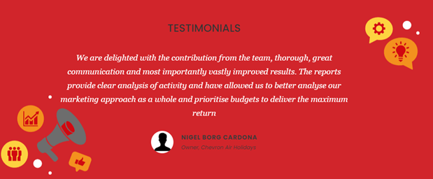
Users are much more likely to buy your product or use your service if they can see that other people have benefited from doing so.
Keep this information towards the bottom of your page – you don’t want to distract a user from the desired action. But, if they are still unsure after scrolling down, this could be that extra bit of encouragement they need.
Keep key info above the fold
Keep the most critical information at the top of your page so that a user doesn’t have to scroll to find it. This is particularly important if your page is highly actionable – whether that’s buying tickets, entering a competition, purchasing a free trial or anything else. Your CTA should be noticeable and easy to find.

Use captivating CTA’s
Once a visitor has decided to click through to your page, it’s time to encourage them to convert and click your CTA. Alongise keeping it above the fold, there are a few things to consider when optimising your CTA:
- Keep it brief
- Create a sense of urgency
- Personalise your CTA
- Use contrasting colours and white space
- Use an eye-catching button
Once your CTA has gone live – keep testing it’s placement, style, colour and text. A/B testing can ensure you’re driving maximum results.
Increase your site speed
If you’re noticing a high bounce rate on a specific page, it could be because it’s too slow. Avoid using anything too heavy and don’t overcrowd your page with videos and other visuals.
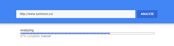
Google’s PageSpeed Insights can provide you with reports on your page speed on both mobile and desktop. It will also give you recommendations on how you can improve your site speed and user experience. Make use of these insights to ensure you’re not losing potential customers.
Use compelling visuals
Images and videos can help users get a better understanding of your product or service. Pairing your headlines and supportive copy with a visual cue is likely to encourage engagement than text alone.
If you’re not using your own photography, then it’s best to use high-quality, authentic photos from sources providing free stock images, for example, Unsplash.
If you’re receiving high bounce rates then it’s likely there is something missing from your landing page. Having a high-quality page that is optimised for conversions can ensure you are getting the most from your PPC traffic.
If you need someone to step in and audit your existing landing pages or create a high-converting page for a future campaign, get in touch.