Reach out to more mobile users
Most shoppers are likely to use mobile devices to search for new products (which comes as no surprise) but means we should be adapting our PPC campaigns as a result.
You might have read our previous guide on how to optimise a landing page for conversions. Today, we’re going to focus on PPC mobile landing pages.
We’re going to look at how we can turn landing page traffic into revenue. Below, you can find five of our best practices to help drive a better return on investment (ROI) for your business. But before we dive in, what is exactly is a PPC landing page?
What is a landing page?
A landing page is a web page that will appear when a user clicks on a search engine result, marketing promotion, email or PPC ad. The key difference between a homepage and a landing page is that a landing page is customised to a specific campaign or offer.
A landing page is a part of the process which leads users towards a call to action (CTA), meaning any PPC ad should be followed with a high-quality and relevant landing page.
How to drive conversions from a mobile landing page
1. Create a separate landing page for mobile
It’s generally not enough to be mobile-friendly anymore. It’s best to focus on mobile users and desktop users separately by creating two landing pages.
When creating your mobile landing page, consider how well it will flow compared to the desktop version. Mobile users browse differently, so it’s important to customise a page accordingly. It’s best to map out your mobile customer journey and then build your page optimised to these users in particular.
2. Add mobile-optimised popups
Popups can be useful as long as they’re fully optimised for mobile and meet Google’s guidelines. The most important thing to remember here is to keep things simple and as non-intrusive as possible.
When used correctly, popups are a great way to increase conversion rates and drive valuable leads. Here is an example of an intrusive popup from Google:
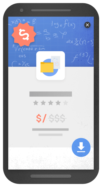
If you’re using forms, limit them to fewer fields, for example, just a name and email address. Make sure the popups, in general, are small and don’t take up much of the screen.
3. Use a click-to-call button
Key information like business hours and pricing, can help users navigate your site and easily communicate with your business. When optimising for mobile, calls are the key point of communication.
Most mobile users will be on-the-go and be more likely to get in touch if they can find an accessible click-to-call button.
If you’re using WordPress, you can do add an eye-catching button using the WP Call Button plugin. You’ll be able to customise the button to match your landing page.
4. Click-to-scroll
Try to keep your mobile landing pages as concise as possible. Place any essential information above the fold (the top half of the page) so that a user doesn’t have to spend time scrolling. When a page exceeds the size of a mobile screen (which is likely), you could consider using navigation buttons.
5. Use shorter copy
Your mobile landing page doesn’t need to contain all of the same copy from your desktop page. Try to prioritise short and even abbreviated copy.
You can adopt a ‘less is more’ approach when optimising for mobile. This can still be appealing and colourful, but you’ll want to get to the point quickly to avoid high bounce rates.
Here are some ways you can reduce the text on your mobile landing page while still having maximum value and encouraging conversions:
Shorter paragraphs
Sentences and paragraphs should be kept short and easy to follow. Try to avoid having big blocks or walls of text. Instead, you can break up paragraphs with subheadings to help visitors find key points when skimming the page.
Bullet points or numbered lists
You can use bullet points or a numbered list to get any key pieces of information across in smaller chunks of text.
You can often do without some of the supporting copy that surrounds a point. You could also use the navigation button we mentioned earlier to provide users with the option to find out more.
Lists generally draw more attention than a huge chunk of words, making your key points less likely to be overlooked.
Less visuals
Having too many images, videos, or other visuals on your mobile landing page can cause visitors to become frustrated and leave a page. Images and videos take up more data than text.
Not all mobile users will have access to Wi-Fi – so will be relying on their cellular data. With this in mind, try to keep visuals to a minimum and optimise and compress any images you use.
To cut down on images – avoid using too many that are purely decorative. When using videos – avoid having them on auto-play. Again, when a video plays automatically, it will use up data and possibly deter users from your primary call to action. Instead, have a button that requires users to click for the video to start.
A landing page doesn’t need to include every piece of information about your brand, product or service. So, only include a video if it relates to the relevant PPC ad and CTA.
Need some extra help with a campaign?
A PPC landing page is just as important as your PPC ad copy. If you’re missing out on mobile conversions, then this could be the reason why. Do you need someone to step in and maximise performance on your mobile campaigns? Get in touch.